

LOGO // LETTERMARK // BRAND IDENTITY // HOUSESTYLE GUIDELINES // STATIONARY // BUILDING SIGNAGE // WEBSITE // NEWSLETTER // LEAFLETS // FLYERS // ACADEMIC BOOKS // MUSIC CD'S // MUSEUM SHOP MERCHANDISING // PRESS ADVERTISING // TV SPOTS // TEMPORARY EXHIBITIONS, EVENTS, FESTIVALS & CONCERTS PROMOTIONAL MATERIAL // POSTERS
In 2004, I began doing graphic design for the mim, Brussels' musical instruments museum. The museum had recently moved its vast collection to a restored historical building and needed its new location and name to be easily associated and recognized.

LEFT Facade of the museum, half in Art Nouveau (Old England building by P. Saintenoy) and half in Neoclassical style (by B. Guimard).
RIGHT Metal cast logo above the main entrance to the museum.
RIGHT Metal cast logo above the main entrance to the museum.

LEFT Official logo of The mim (as from 2006) in its single acronym icon version.
RIGHT Logo coupled to its full name (typeface Emigre Ottomat) and brand colors flag banner.
RIGHT Logo coupled to its full name (typeface Emigre Ottomat) and brand colors flag banner.
By 2006 I had created the museum's visual identity and was promoted to Art Director, implementing the brand for yet another four years within the building (signage and exhibitions) as well as for all print and online promotional, educational and scientific publications. The new identity comprised a logo redesign, color and typeface guidelines and an array of brand extension graphics inspired by luthiers' craft, music notation, sound representation and Art Nouveau decorations present in the museum building.
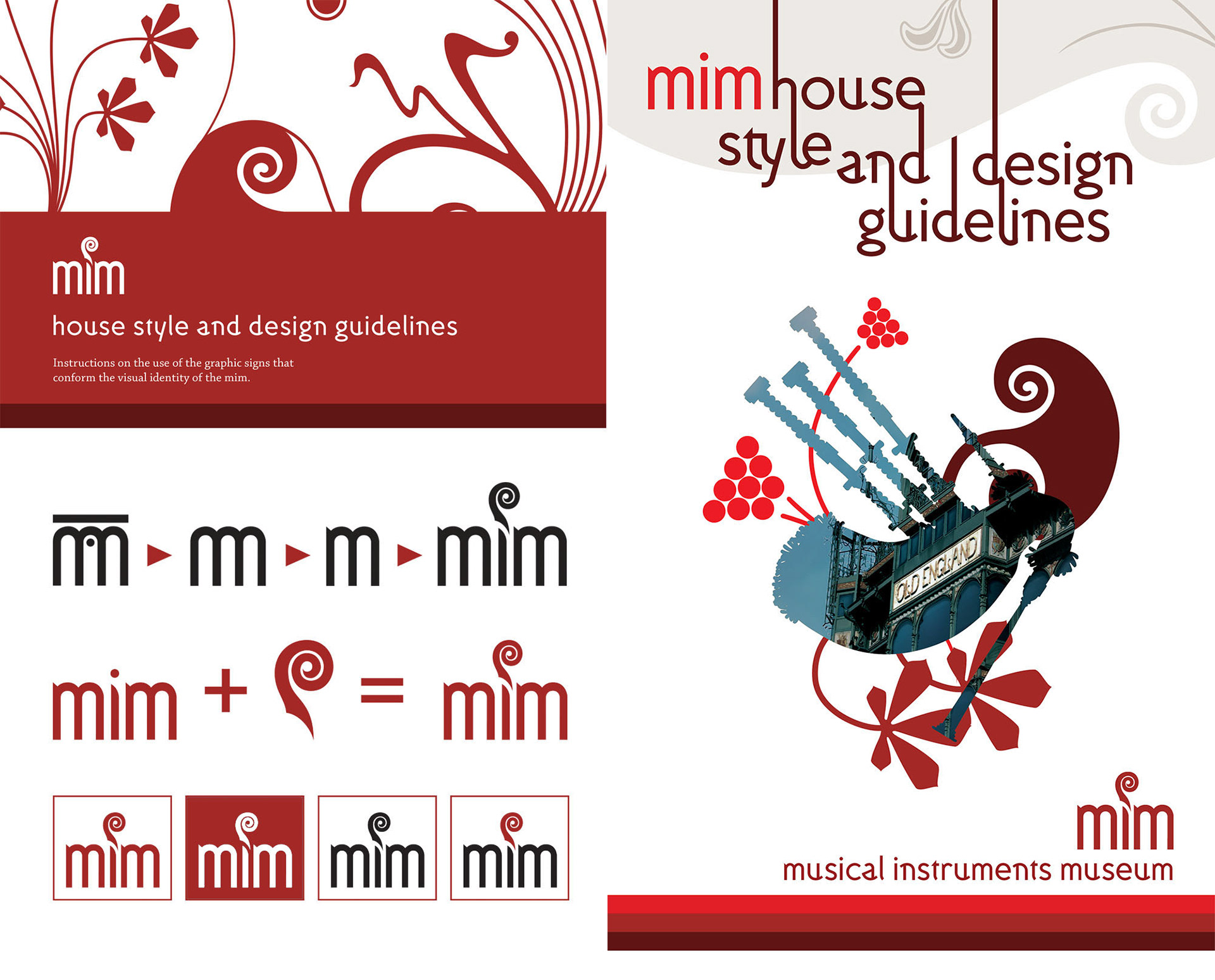
TOP LEFT Cover for the 2006 design guidelines, introducing the new logo, typefaces, brand colors and graphics.
BOTTOM LEFT sample graphics from the guidelines. The mim belongs to a family of museums, the "Royal Museums of Art and History" which has its own logo. The small caps "m" in The mim logo is designed to maintain the same curves and stems.
RIGHT cover for the 2010 design guidelines. The guidelines in itself remained the same, but the document compiled and exemplified its best practices.
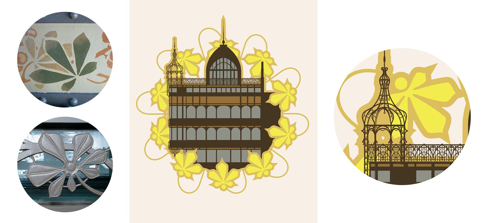
Horse Chestnut leaves —a common decoration in Art Nouveau— are particularly present in the Old England building. Since the building itself was part of the identity of the museum, I translated the motive to vector art to incorporate to its graphic identity. LEFT Details of Chestnut leaves in the museum building.
CENTER Illustration I made for the ten years aniversary of the mim, in 2010. RIGHT Detail of illustration.
CENTER Illustration I made for the ten years aniversary of the mim, in 2010. RIGHT Detail of illustration.
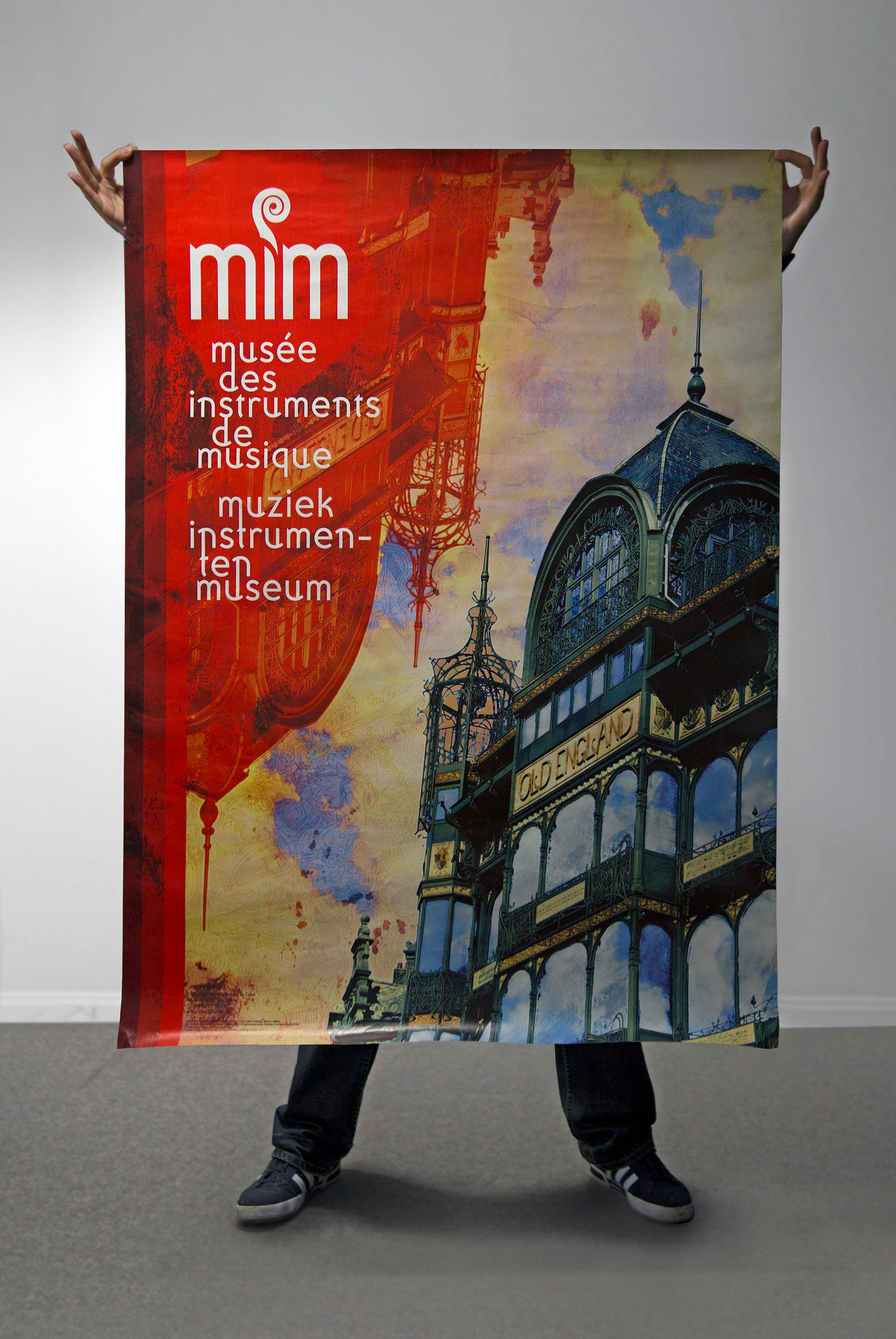
The restored Old England building got the attention of Brussels' locals and visitors but it took a long time until it was widely known as the museum. So we decided to paper the city with a large poster right after the new logo and first elements of the identity system were ready. The brief of this project was to associate the image of the building to the name of the museum but also to convey that the museum was not only about historical and classical instruments but also about fun activities and music for all ages, especially for the young ("like MTV" —was part of the brief). The poster became one of the most popular items at the museum shop, sold for many years after the campaign.
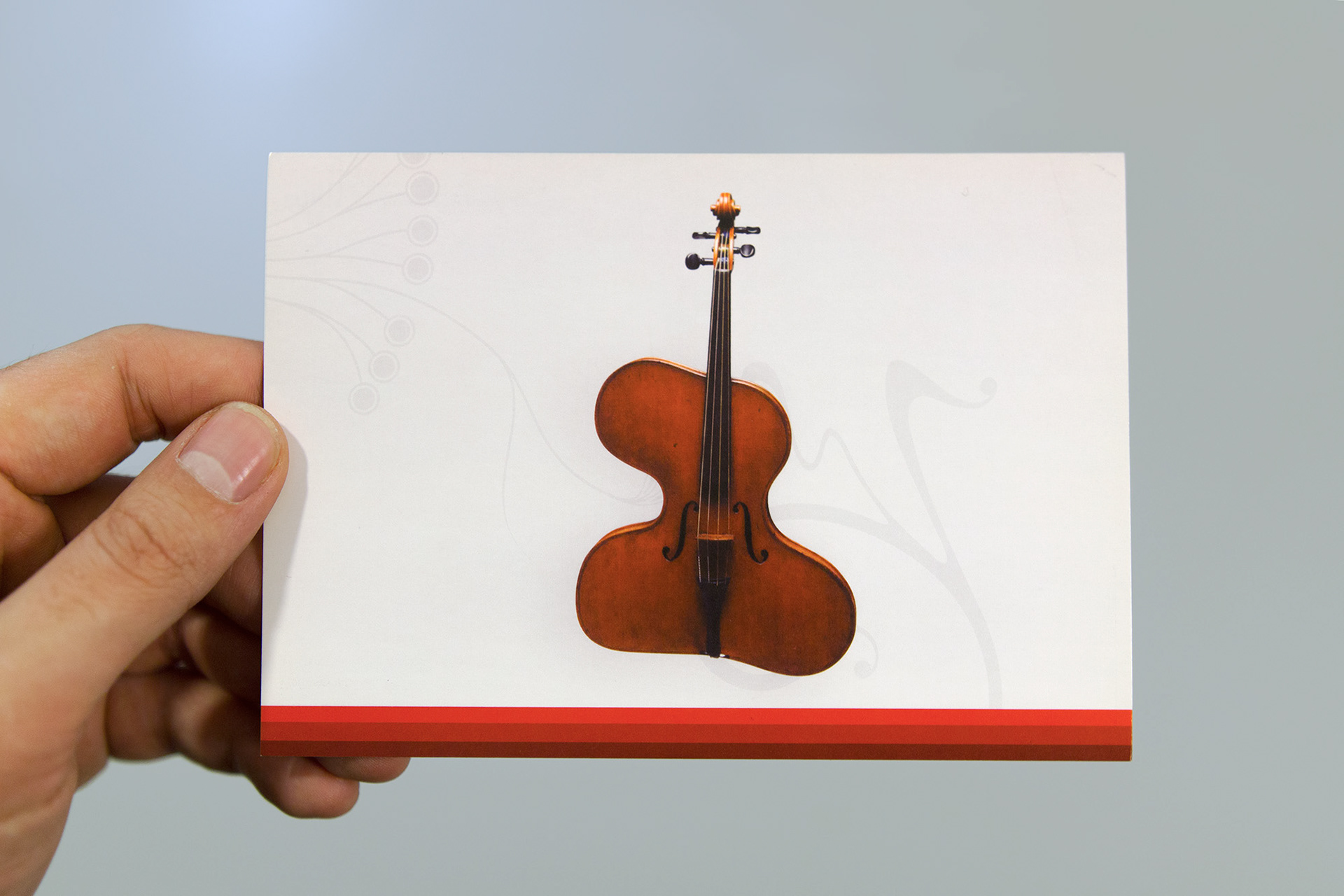
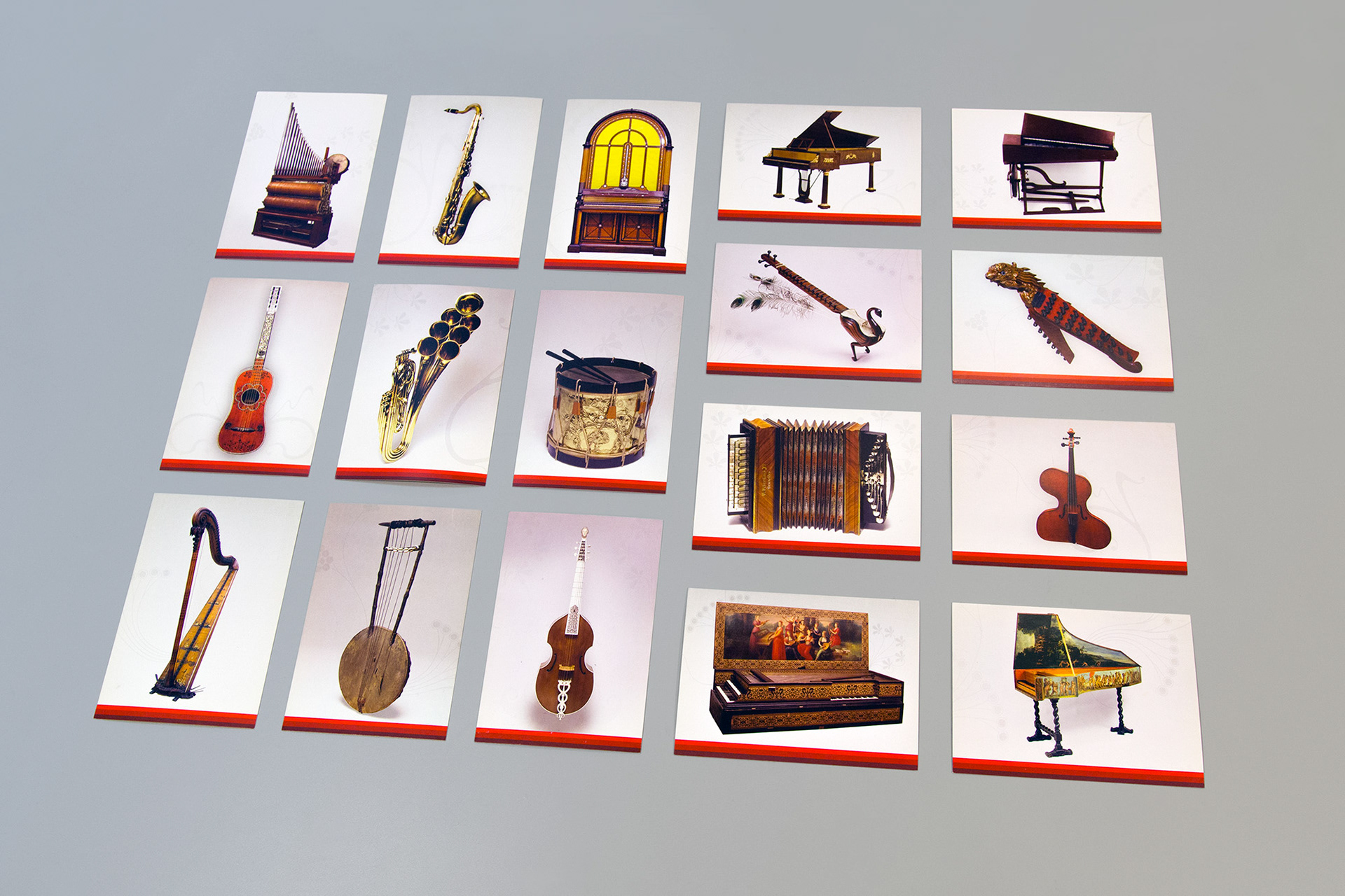
The brand identity was also applied to merchandising, like postcards featuring instruments from the museum's collection.
Nowadays The mim is one of the most important players in the cultural landscape of Belgium and Brussels, welcoming more than 125.000 visitors per year.